

Overview
NicYou is a digital tool that helps NICU parents obtain information and communications about their infants.
I researched and designed this product as my thesis project for the UX Design Masters program at Maryland Institute College of Art. It received a department award for academic and professional excellence, one of four prizes awarded in a 60 student cohort. The finished product reimagines the way caregivers of hospitalized minors contribute to the care of their children and themselves.
Pitch Video

Background
In May of 2020, my son was born needing a special surgery and spent just under 4 months in the neonatal intensive care unit.
I was with him each day. A dry erase board at his bedside was my most reliable source of information when nurses were busy, and I wished I had access to it while outside the unit. I wondered why this couldn’t be a digital tool, if it it were, in what additional ways it might help parents.

Spread from baby diary study
Supporting information
I looked to academic studies to support my hypothesis that the concept of a digital whiteboard would be useful to NICU parents.
The Picker Institute of Europe conducted a study concluding that only about half of NICU parents felt included in discussions about their babies’ care.
Along a similar line, the BMJ Open Quality Journal examined the effects of a simple, paper “baby diary” on parent satisfaction. Where implemented, these baby diaries contributed to a nearly 15% increase in parent satisfaction with communication from physicians and nurses. Yet, the diaries suffered the same flaws as my son’s dry erase board: they weren’t always up to date, and were only accessible to parents in the hospital, not at home. My digital tool would aim to solve these problems.
Problem Statement
At this point, I developed my problem statement:
Parents with babies in neonatal intensive care units struggle to communicate with medical staff about their babies’ health conditions, both in and out of the hospital.
Users & Audience
While a fully realized product would include a view for medical practitioners, the intended audience in this phase of the project are caregivers of infants in neonatal intensive care units: birth parents recovering from childbirth, and co-parents supporting both mother and baby.
Roles & Responsibilities
As this was my thesis project, I conducted all the user research, design and prototyping work myself. I had an 8 week timeline to complete the project from research to final prototype. View my project plan on Trello.
Challenges and Constraints
I faced a variety of roadblocks during this project. COVID-19 necessitated that all my user interviews occur online instead of in-person. I also had a very short timeline within which to complete this project, while caring for a newborn who had just come home from the hospital, and working from home full time during a busy season at my job. My passion for the subject matter drove my motivation to complete this project.
Process
To build my product, I conducted user research and desk research, analyzed the resulting data with trend-spotting exercises, synthesized the data using traditional UX visual artifacts, and designed iteratively starting at a very crude fidelity and gradually working up to a fully skinned prototype. I conducted user testing in low and high fidelity phases.

Research Plan and Methods
My research plan consisted of in-depth user interviews, competitive analysis, and additional research on HIPAA/HITECH.
Interview Subjects

I had the pleasure of speaking with 7 parents across 6 different families whose babies had experienced time in the NICU.
Because I was so intimately familiar with the problem I was researching, I wanted to make sure I spoke with a diverse set of parents who would give me unique perspectives that didn’t necessarily reflect my own. My interview subjects span a variety of income levels, ages, and geographical locations, and their babies’ have experienced a range of health conditions.
Findings
By affinity mapping my user responses, I was able to spot commonalities in their experiences.

Assumptions confirmed
Among those trends, many of my previous assumptions were confirmed, including:
The NICU is a busy place and doctors/nurses can't always be interrupted or tracked down when parents need them most.
Mom is in recovery too, and/co-parents have the tough job of caring for two medical patients.
Parents don’t feel like they have the luxury of spending time away from the NICU
Inside the unit, parents rely on getting information from nurses verbally, sometimes accompanied by information on a whiteboard or sheet of paper.

Insight
Something I heard a lot was the notion that parents loved their nurses but were hesitant to disrupt them.
What I gleaned from this is:
Parents need a more reliable way to ask for and receive information about their NICU babies.
Assumptions challenged
I also determined that a number of my assumptions were disproved, such as:
Prior to learning of their babies' conditions, none of the parents had ever considered that a NICU stay was possible for their families.
Even for families who were eventually given warning that their child could end up in the NICU, they didn’t process what that meant until they were there.
Inside the unit, parents were eager to get information about their babies. Outside the unit, they were paralyzed with fear to make or answer phone calls with the hospital.
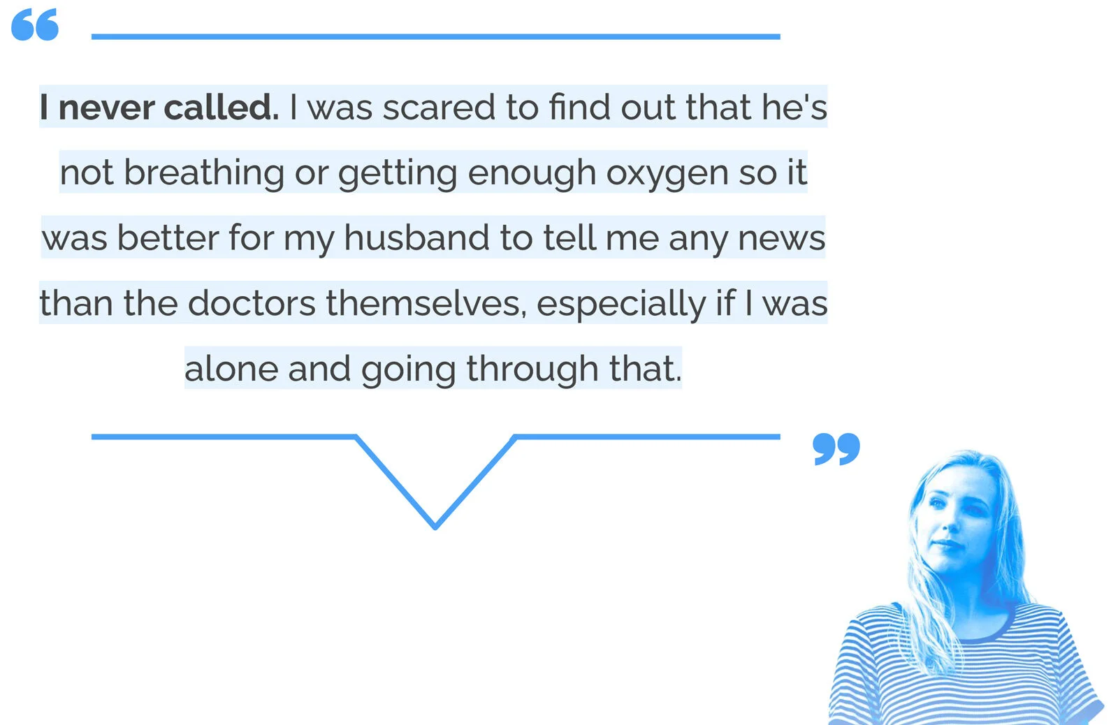
Insight
I heard a shocking number of accounts from parents who never once called to get updates out of fear.
From this I really realized that:
Parents need a way to make unexpected information feel less scary to receive.
Other interesting findings
I learned a few other interesting things too:
Whether it's the sadness of not having your baby next to you or setbacks on the road to recovery, the hardest parts of being in the NICU are dealing with upended expectations
Most families rely on the nurses for most information in the NICU, but families with longer NICU stays and more critical babies depend more on the doctors.
Parents are so focused on their child's recovery that they feel they can’t focus on their own emotional and mental health

Insight
Many times I heard this belief of “my baby’s health comes first, I’ll deal with myself another time.”
This lead me to believe that:
Parents need help prioritizing their own mental health during their baby’s NICU stay.
How might we statements
I developed how might we statements from the insights I gained:
How might we help parents obtain and maintain information about their NICU babies?
How might we make parent/medical staff communication easier and less scary?
How might we give NICU parents emotional support and physical comfort?
Competitive analysis
I researched a few products that share principles with my concept including an app that parents use to communicate with daycare providers, a few NICU family resource apps with baby diaries that the parents can fill in, and the widely used medical information app, MyChart. My product would need to be an amalgam of the most useful aspects of all these products.

Empathizing
In beginning to empathize with my users, I initially thought of them as two separate groups—Parents in the hospital, and parents outside of the hospital. But in conducting empathy maps, I realized that between these two groups, there was a lot of overlap in their thoughts and feelings. I ultimately developed one persona.


Persona

Customer Journey Map

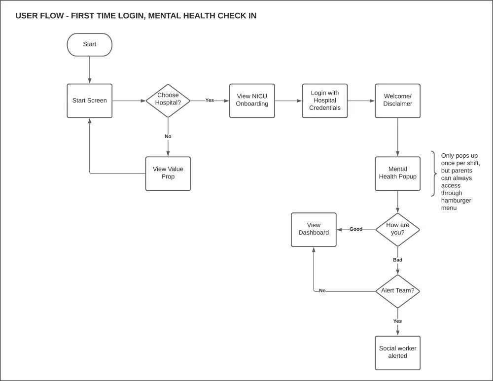
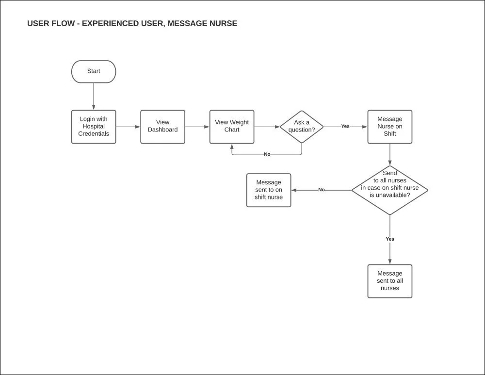
User Flows


Design
From here I began sketching and developing the UI, keeping the words “authoritative,” “calming,” and “supportive” in mind as principles.


Style Tile
I put together this style tile to guide my visual design using soothing colors, very legible type and prevalent staff photography which is especially important in the masking era of COVID-19.
Low Fidelity
Due to time constraints, I quickly brought my sketching into digital low fidelity without doing any paper prototyping. I was able to focus on user testing on a few key flows.
ONBOARDING

MENTAL HEALTH CHECK IN

DASHBOARD

Prototype
The high fidelity prototype depicts a health dashboard in two color modes with detailed views of health statistics, messaging, resources, and policies.
Walk through full prototype here.
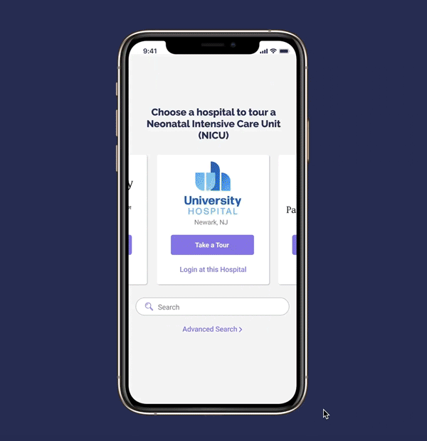
Onboarding Flow
The app has immediate user value upon download, even if the user’s baby hasn’t yet been admitted to the NICU. I learned in my interviews that preparation for the NICU contributes to a better experience, so the onboarding serves as an aggregate of NICU tours, where parents can compare NICUs in their area.
Selecting a participating hospital presents a video, information on what conditions the NICU treats, and the option to schedule a meeting with hospital staff.
Once a user’s baby has been admitted, parents can log in at their chosen hospital using their hospital-issued bracelet ID number. Once the bracelet number is entered, users would also provide a fingerprint or face recognition as HIPAA-compliant physical verification.

Mental Health Check In
Upon the first log in of each calendar day, parents are greeted with an optional mental health check in. This check in aims to help parents feel seen and heard, and also helps hospitals know which parents are in need of the resources they provide. If parents indicate they aren’t doing well, they’ll be offered the option of meeting with a social worker at their next NICU visit.
This flow gives parents a quick, passive and frequent way to give attention to their own mental health during a time when that may not feel possible.

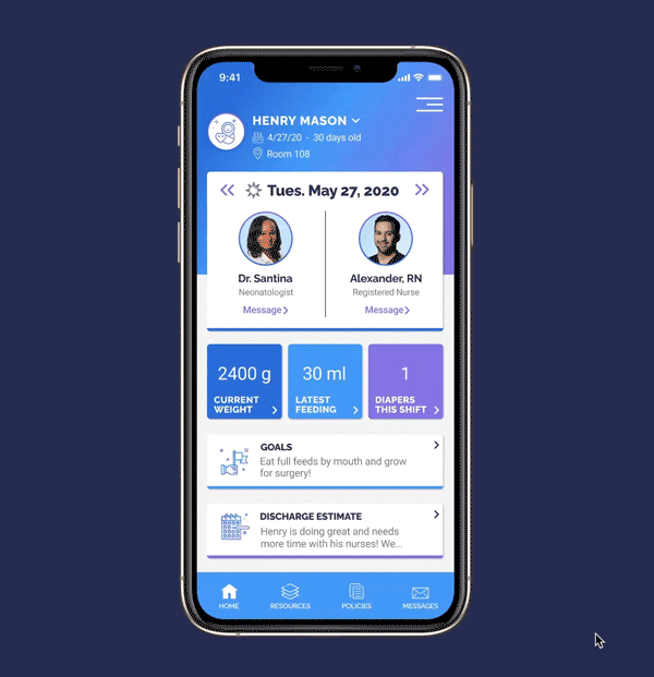
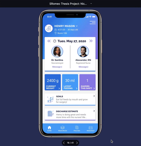
Dashboard
This is the main dashboard, based on the whiteboard that inspired the project, complete with information that was identified as most important by my interview subjects. The dashboard depicts a baby’s information during the current 12 hour shift, including the baby’s name, date of birth, current location, attending neonatologist and nurse, weight, feed and diaper information, as well as goals and a discharge estimate.
Tapping on any health statistic reveals a deeper level of information including a day by day list of that particular stat, and a data visualization of trends over time.
Arrows on the main dashboard allow parents to skip back and view stats and staff assignments from previous shifts. Night shifts are displayed in dark mode, both as a visual cue indicating the different time of day as well as optical comfort during late night browsing.
Messaging
I feared that giving parents too much information would disincentivize communication with doctors and nurses, which is a critical facet of caregiving, so throughout the product, wherever information ends there is always a call to action for messaging with hospital staff. In the message center, parents can message with on-shift staff in each department that treats their baby.
Though each message is initially sent to their baby’s caregiver, any on-shift department member can answer the message after 60 minutes. This feature was primarily intended for HIPAA compliance and the resulting popup was intended to be informative, but during user testing I was told that the message was also comforting, which was a great unexpected effect.
Resources and Policies
NicYou also acts as a home to resources hospitals provide parents, as there are many and they usually come as a scattered list of links and photocopies. For instance, most NICU’s have 24 hour live streams that parents can access through a website called NicView, which is accessible here through a web view.
One problem I was not able to validate with the users I spoke with, but saw many parents experience during my time in the NICU, was day to day policy changes due to Covid. I’d have to call each morning to make sure I was even allowed in the hospital. In thinking of ways NicYou could utilize push notifications, I decided to make a category for policy change updates. If a user opted in to these notifications, each time a policy was updated, they would get a push notification alerting them of the change. Then, on the Policies page, alerts and highlights would make clear where the change occurred.
Reflection
The result of this study is an information and communication portal that reimagines the way caregivers of minors contribute to the care of their children and themselves.
It’s also tool that medical providers can suggest to parents as a means to educate them, and possibly drive more women to give birth at hospitals rather than choosing home births or birthing centers.
Next Steps
Next, I will design a medical staff-facing view of the product, and research how medical charting tools like Epic could help automate some of this information. My son’s nurses spent an absurd amount of time charting information in Epic, so it would be ideal if these two tools could work together and ultimately save staff a little time.
In my research I also learned about the Open Notes Movement, which is an international movement that promotes and examines the effects of fully transparent communication in health care, and I’d like the caregiver and medical staff sides of my product to work together in support of that movement.